Sunday, July 13, 2008

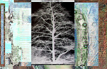
Things take time and they morph and I forget. This is close to a smaller file size version of image taken at the beach:


At some point I played with tone and colors in MS Office Photo Manager:


Then I used paint.net to select colors and use paint buckets:


Then I sharpened and tinkered a tiny bit The end of the line:

Saturday, June 21, 2008

Turn It Upside Down


Compare to original version in typos - the easiest way for me to see images side ways, up and down is on my BlackBerry. Lovely tool, I mean it. Hell of a color screen. Jewel.

I never wanted one and now it is a berry placebo.

Flipping it here has made it less abstract p0 more of a wood block landscape. I admire Hiroshige.

Thursday, June 19, 2008

Cutting Back Wisteria

CSeries of images, last one posted in typo.land - in the end I blocked of spaces in MS Paint - used an odd font - typed like a quarter mad man then selected color and colored in the negative space and then sliced and diced at the end.


Cut and paste lines:


Play with inversions and copy and paste:


More play:


Font is an easy compositional element - I consider it kind of cheap and almost cheating. Words carry weight, sometimes emotion - I often stop making sense on purpose....the word "work" was added among a number of w's, but most of of "work" got covered over by basting and pasting.


I do see windows, dark as they should be to conserve energy and the oppressed work force.

Under.time

Thank you, Sue for the photograph.

Tuesday, June 17, 2008

The first four posts have been moved to draft status today- let me know if you need them. Spell poorly...pleaze.

simmer.vacation?

Thursday, May 22, 2008


Two versions of a lovely Lisa NZ post - seeming more like Pissaro than photographs. Only alteration was cropping using MS Office Picture Manager.

My BlackBerry is a marvelous tool for seeing images small and the BB frame often reveals cropping possibilities. It is like having a pair of tri-focals for sub parts.

Thank you, Lisa. You are a sport.

I hope all of you understand if I kid around it never is meant maliciously. And the intent here is not to say my versions are "better" - the image was just excellent to demonstrate how much a photo changes with cropping (focusing the viewer's eye). There is a subtle difference In the two photos - part of me prefers the tighter crop because of it is claustrophobic. Creates tension.

Part of art is the choice of how much tension or movement to project. My work is focused on the weight or lightness of the composition.

I always preferred to shoot full frame, but at this time I do not have a real SLR with changeable lenses.

Monday, May 19, 2008

MS Office Picture Manager

Original image as posted in typos - no manipulation as taken off camera other than reduced size.


Below is a screenshot where you click on Edit picture and see options - to modify contrast, color, crop, compress size, etc,


All manipulations below done with Microsoft Office Picture Manager - in the first image we ramp up Saturation and Hue.


Below we also play with Amount.


Now we change amount again...just to show difference.


Here we auto-correct - lazy, lazy, lazy.


An now we change Contrast - see various slide bars. The midtone slide bar is quite helpful sometimes.


Great tool for modifying color, contrast and cropping.

Remember when you are done to "SAVE AS" and do not - NOT - NOT - NOT "SAVE" again when you close the program.


This post will be taken down in a week or two....trade secrets you kn.ow.

Friday, May 9, 2008

Paint Your...

Before we got here I experimented with MS Paint and also played with tone, etc and and then cropped down to this.


I like Microsoft Office Picture Manager because it crops precisely and because it has good color manipulation and reliable contrast editing functionality. I used the app to modify to look as the image below.


MS Paint is a simple program and in that ability lies its calm beauty - you cannot be flashy with it unless irrational. The software Paint,.net blows Paint out of the H2O, but Paint still has a couple of features I use. For example top overlay areas with white sections. Pure white areas can be made transparent when pasted.

I made the image, below, by playing with various contrast and brightness features in Microsoft Office Picture Manager. Nice thing is you can modify *bleach)the mid tones.


The image above was created to use for "copying and pasting" into the original image. The altered image, below, includes some additional edits after the paste. To do this I "selected all" in bleached version and then "copied and pasted" into the regular image. You can m,pve the overlay around.

For the white in the "paste" to become transparent, you need to select the lower "paste" icon in MS Paint (see box and arrow). This "paste" box only pops up when you paste.


Final as posted in typos:


Remember to "save as" when using Microsoft Office Picture Manager and then do not save when prompted as you close the program.

MS Paint "save as" is a wonderful cautious step since you can only "undo" the last three edits within MS Paint, whether those edits are large or small.

Creating this started slowly - a lot of work before the image at the top. Then it started flowing and it became a dance.

Have fun. OK, we have thirty seconds before the bell to answer any question.